Scalable (Mobile Friendly) versus Responsive Integration
Due to increasing demand for mobile integration services we have responded by adding an additional mobile option, responsive integration. Below we break down the differences (and pros and cons) between the two mobile options.
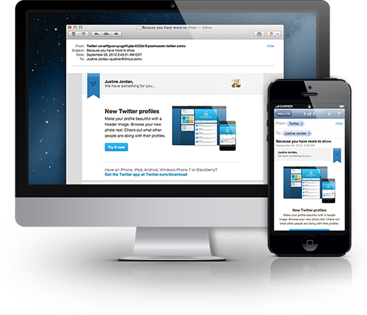
A scalable (or mobile friendly) email layout is readable and clickable no matter what size environment it is being read on. There is only one version (one HTML file) of the email, but the email scales to look great on both desktops and mobile devices.
Scalable design utilize techniques such as:
- A grid system for alignment and proportion
- Larger fonts (at least 14px)
- Touch-friendly buttons
- Scalable images
Pros: Works everywhere, single design, easy to code, readable & clickable in both environments
Cons: Not a “true” mobile design
It’s basically your desktop email but mobile friendlier.
Responsive email designs use CSS3 @media queries to render two different layouts depending on the size of the screen the email is opened on. CSS media queries can auto-adjust the layout, content, and text size of an email depending on the screen size of the device it is being read on.
Responsive email design utilizes techniques such as:
- Multi column to single column layout
- Large fonts (at least 14px)
- Bulletproof Email Buttons
Pros: True mobile-first design
Cons: Doesn’t work everywhere (works mainly on iPhones & some Androids), requires two designs, coding is complex


