Email Best Practices:
Typography
When it comes to typography and email the number one rule is to keep it simple. For the best, and most consistent results, we recommend choosing one (or more) of the cross-platform compatible fonts.
Best Bet Fonts
Choosing from the list of cross-platform compatible fonts is your best bet! These fonts are available on virtually every platform making them an ideal choice when typeface consistency is key.
Sans Serif Web Safe Fonts
- Arial
- Arial Black
- Tahoma
- Trebuchet MS
- Verdana
Serif Web Safe Fonts
- Courier
- Courier New
- Georgia
- Times
- Times New Roman
Monospace Web Safe Fonts
- Courier
- Courier New
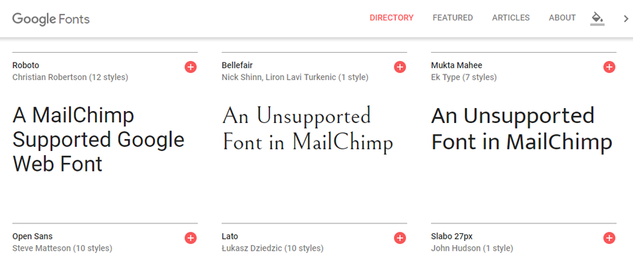
If you’re looking to get a little fancier with your fonts Mailchimp now supports a limited number of Google Web Fonts. Of course, web fonts are still experimental at best and are not yet widely supported across email platforms. For those clients that don’t yet support web fonts, a backup font family will be specified.
For example, if you chose Open Sans we’d specify a backup font family such as Helvetica, Arial, Verdana, Trebuchet MS to ensure your font renders in a cross-platform compatible font in unsupported environments.
Use Experimental Web Fonts With Caution
A (really) small number of email clients support the use of web fonts provided through services like Google Web Fonts. These include Outlook 2000, iOS Mail, Apple Mail, Android (default client, not Gmail), and Thunderbird.
Why can’t I use any Google Web Font with Mailchimp?
Instead of opening up the entire library, Mailchimp hand-picked fonts that match some important criteria. Mailchimp decided that the new typefaces should:
- Look great no matter how they’re styled – italics, bold, and underline.
- Include international character sets in addition to English.
- Be flexible enough for use in both body copy and headings.
- Have some personality, but nothing so intense that it could limit broad appeal.
- Already be relatively popular amongst Google Font users.
- Be an adequate mix of serif and sans-serif typefaces (plus a slab serif or 2) for typographic variety.


