Top 5 Ways to Get the Most Out of Mailchimp in the New Year
Now that the holidays and the subsequent email fatigue have passed it’s time to shift gears and focus on your email marketing strategy for 2013. Here are a few tips from our experts to help you start the new year on the best foot possible.
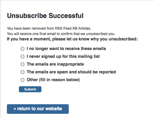
 5. Focus on unsubscribes. A few years back Mailchimp added the unsubscribe exit survey, a great way to poll outgoing subscribers on what you could have done better. While it’s always a bummer to loose subscribers, the brief exit survey is a great tool to help you improve your content for your current subscribers, giving them more of what they want and less of what they don’t. Get key, actionable insight into the reason folks abandon your list, at the moment they choose to do so, giving you honest, valuable information on potential improvements.
4. Optimize your campaigns for images off. Do your emails maintain their hierarchy and pertinent information when images are disabled (or before they’re allowed by the user)? Optimize your email campaigns by maximizing smart use of image alt tags to ensure key details, such as your call to action, are viewable (and actionable) even when in an images-off environment. Keep your image alt tags short and descriptive so recipients aren’t left guessing as to a links’ destination, or what action you’d like them to take.
3. Put an emphasis on social sharing. Make it easy for subscribers to share your campaigns utilizing a mix of Mailchimp merge tags and sharing specific calls to action. And then track those shares using Mailchimp’s Social Stats reporting tools. Social Stats, serves up insightful statistics such as who likes you and how many of your subscribers’ friends do too. Coupling email marketing and social networks together allows you to harness the benefits of each tools individual strengths and amplify them as they work together.
2. Prevent unsubscribes in forwarded emails. You’d hate to put an increased emphasis on social sharing just to have a long time fan accidentally unsubscribed when he excitedly forwards your latest campaign to a friend (or an entire group of coworkers). By introducing an original-only variant* into your template’s coding you can control who your subscriber’s unsubscribe link is shown to and more importantly keep it from being shown to receipts of a forwarded message. Additionally serving up conditional content gives you the unique ability to present potential subscribers (those your message is shared with) with inviting calls to action, such as opting in to your list, that recipients of your original message will never see.

Connections 2012 Key Takeaway: Design for ALL Inboxes
Copyright © Salted Services, Inc. 2005-2012. All rights reserved.
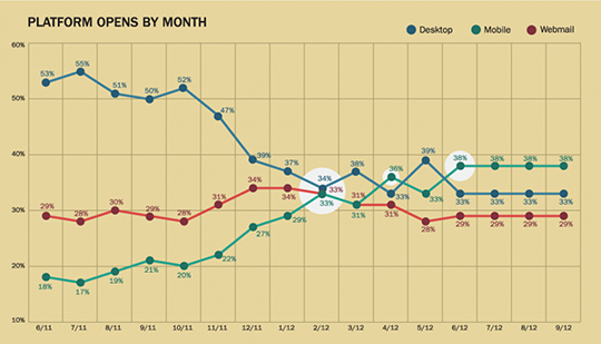
1. Make your messages mobile friendly. Mobile opens have increased a reported 138%(!) in the last 18 months, with a 48% increase in 2012 alone. But designing emails that look great no matter what platform they’re viewed on can be tricky. Fortunately, Mailchimp makes it easy to serve up the right version of your content ensuring your message looks good no matter what. The magic lies in the mobile responsiveness of the template language which relies on media queries to seamlessly shift your content to a more mobile friendly layout when needed and back to the standard desktop version when it’s not.
Looking for more ideas? Check out our previous post, Top 10 Ways to get the most out of Mailchimp (and your email marketing efforts), for ten more ways to maximize your email marketing efforts.
*Unfortunately, this technique doesn’t fully work in Gmail since display: none isn’t supported, and inlining display: none !important can’t be overridden later.


