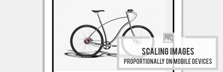
Scaling Images Proportionally on Mobile Devices using Mailchimp
If your Mailchimp template includes mobile integration allowing your email to scale automatically based on the device it’s being viewed on you may have noticed an issue pertaining to the height of your scaled images. Mainly disproportionate scaling of your image resulting in a too tall height in relation to the scaled down width.
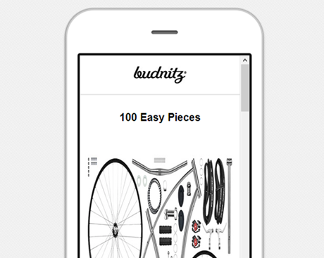
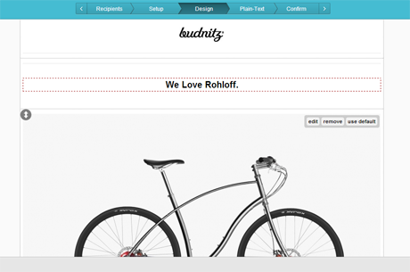
Disproportionate height when viewed on mobile devices
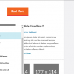
When replacing placeholder images in your campaign often times the hard height of your newly uploaded image will override the height: auto default for images coded into your template.
In order to ensure your images continue to scale proportionally on mobile devices, you should first uncheck the “keep proportions” check-box and set all image heights to auto.
Below is a brief run through of how to do exactly that in three easy steps.
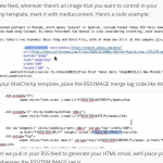
1. To update your image(s) click the edit button that appears when hovering over your image in the Mailchimp editor.
2. Upload your campaign image(s) using the file manager. Your default image properties, including width and height, will be displayed along with other image details.
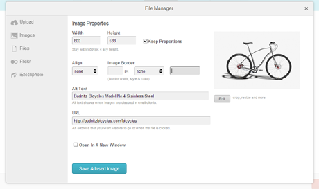
3. First uncheck the “Keep Proportions” option box. Then edit the image height property to “auto” making sure to maintain the other image properties including the width. Save the changes to your image properties to apply.
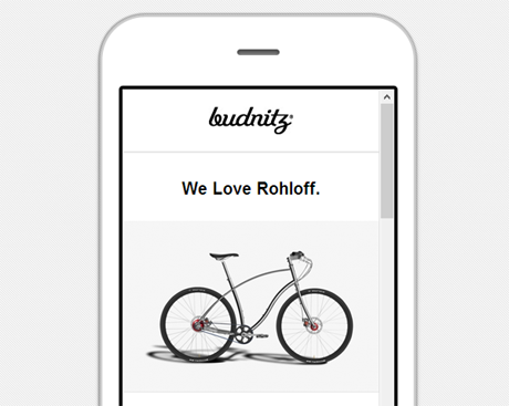
That’s it; fairly painless right? Your images will now scale proportionally on mobile devices.